Help items in Backoffice
Tooltips and Popovers
User helps are user-triggered messages that provide additional information about an element or feature. There are two ways to trigger this messages (tooltip or popover).
| Settings | Tooltip | Popover |
|---|---|---|
| Initiated By | Hover (mouse) | Click |
| Terminated When | User leaver predefined interaction area | User taps to close or click another area of screen |
| Paired Element | Page element label | “i” icon |
| Content Type | Succinct help | Succinct or Verbose help |
Definition in Genio
Add the "Help" to the element:
- Define a succinct message - mandatary
- Define a verbose message - optional
- Define a help - not yet implemented
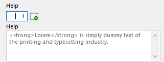
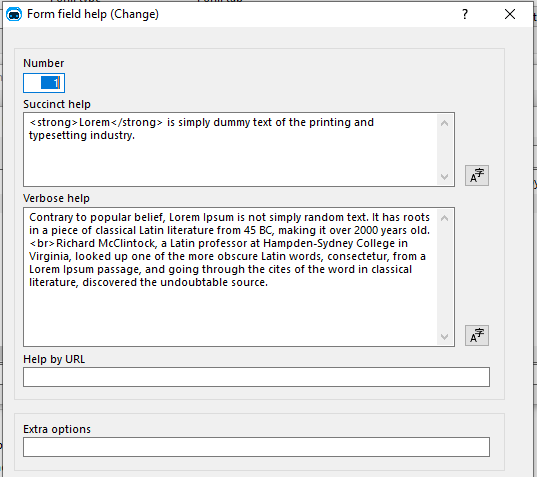
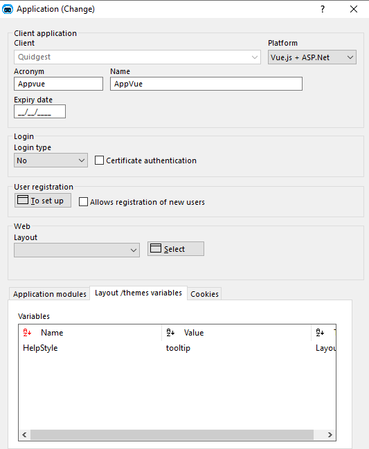
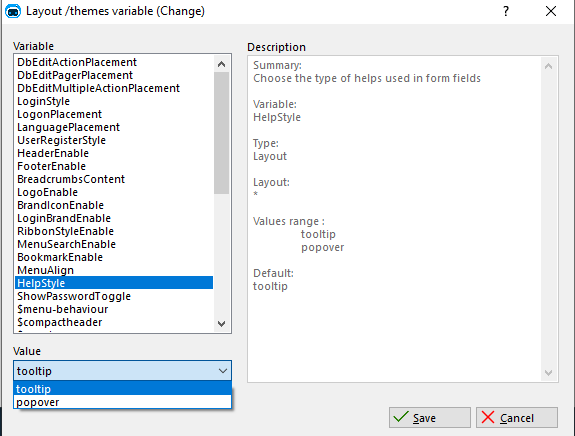
The definition of the type of help can be done in Layout/theme variables.
By default, the type of help is the tooltip, but you can change it to the popover.
Tooltip
The tooltip is usually used to provide the user with a succinct help to the element on the page.

When the developer chooses the Help type as Tooltip:
-
It will appear help succinct in a tooltip
-
If there is a verbose message defined it will appear also in the popover.
Popover
The popover is generally used to describe in more detail the help of the page element.
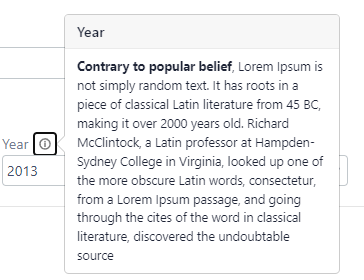
If there is just a succinct message it will appear this message in the popover; Otherwise will appear the verbose message.
Summary
| Message type | Tooltip | Popover |
|---|---|---|
| Succinct | Tooltip (Succinct) | Popover (Succinct) |
| Succinct and Verbose | Tooltip (Succinct) and Popover (Verbose) | Popover (Verbose) |