Cards
Cards are the first type of visualization modes provided by Genio with full customization capability. On certain occasions, cards can enhance the user experience by displaying the information in a way that looks fresh and different.
Subtypes
The card component offers various variants, each offering unique visual styles and layouts. Currently, Genio includes the following card subtypes:
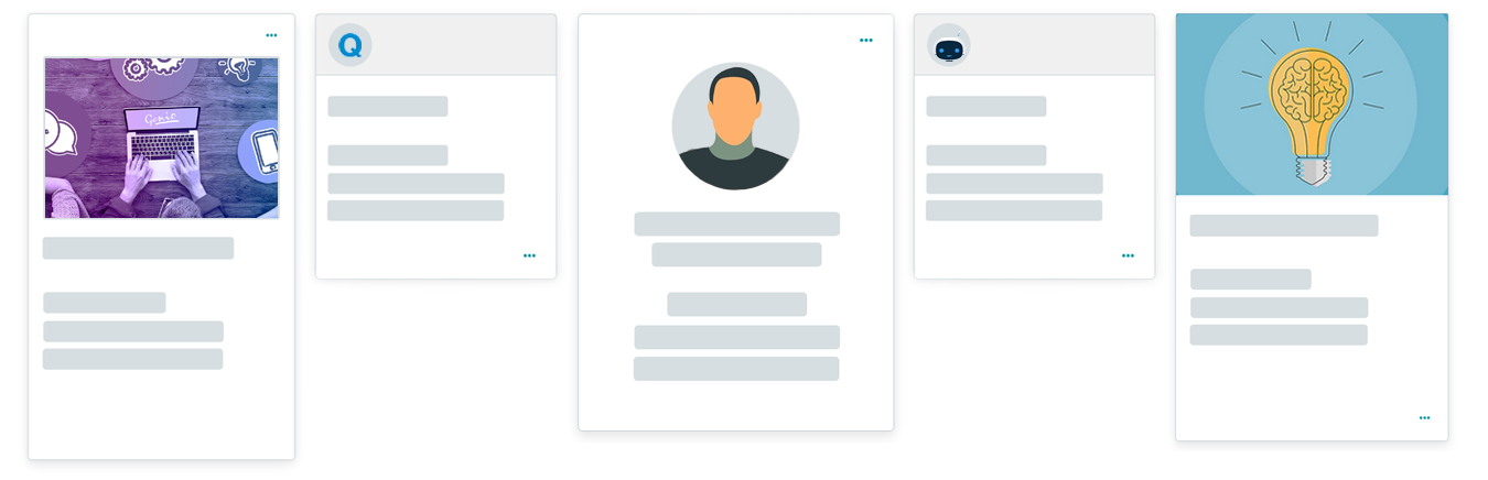
card
card-img-top
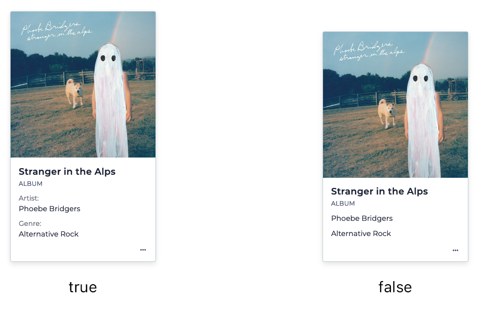
card-img-thumbnail
card-img-background
Customization variables
To enhance the level of customization for each individual card subtype, Genio provides developers with powerful customization variables. These variables grant fine-grained control over a wide range of aspects, including the appearance and behavior of the cards. With the flexibility offered by these customization variables, developers can precisely tailor the rendering process to meet their specific requirements.
card-bg-color
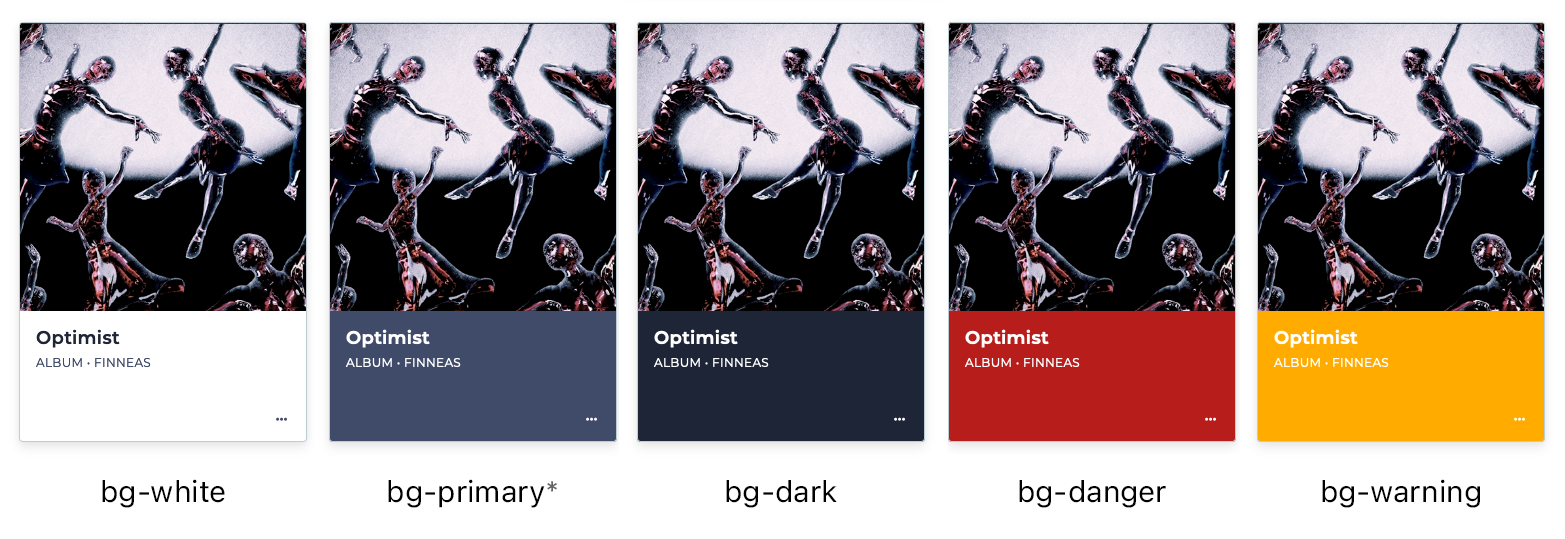
* the bg-primary and bg-secondary options use the values of the CSS primary and secondary variables, respectively.
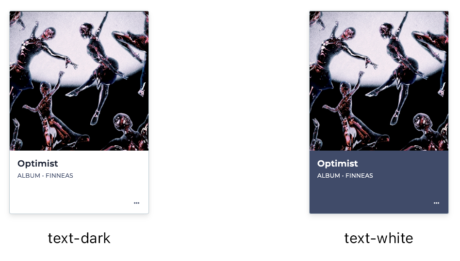
text-color
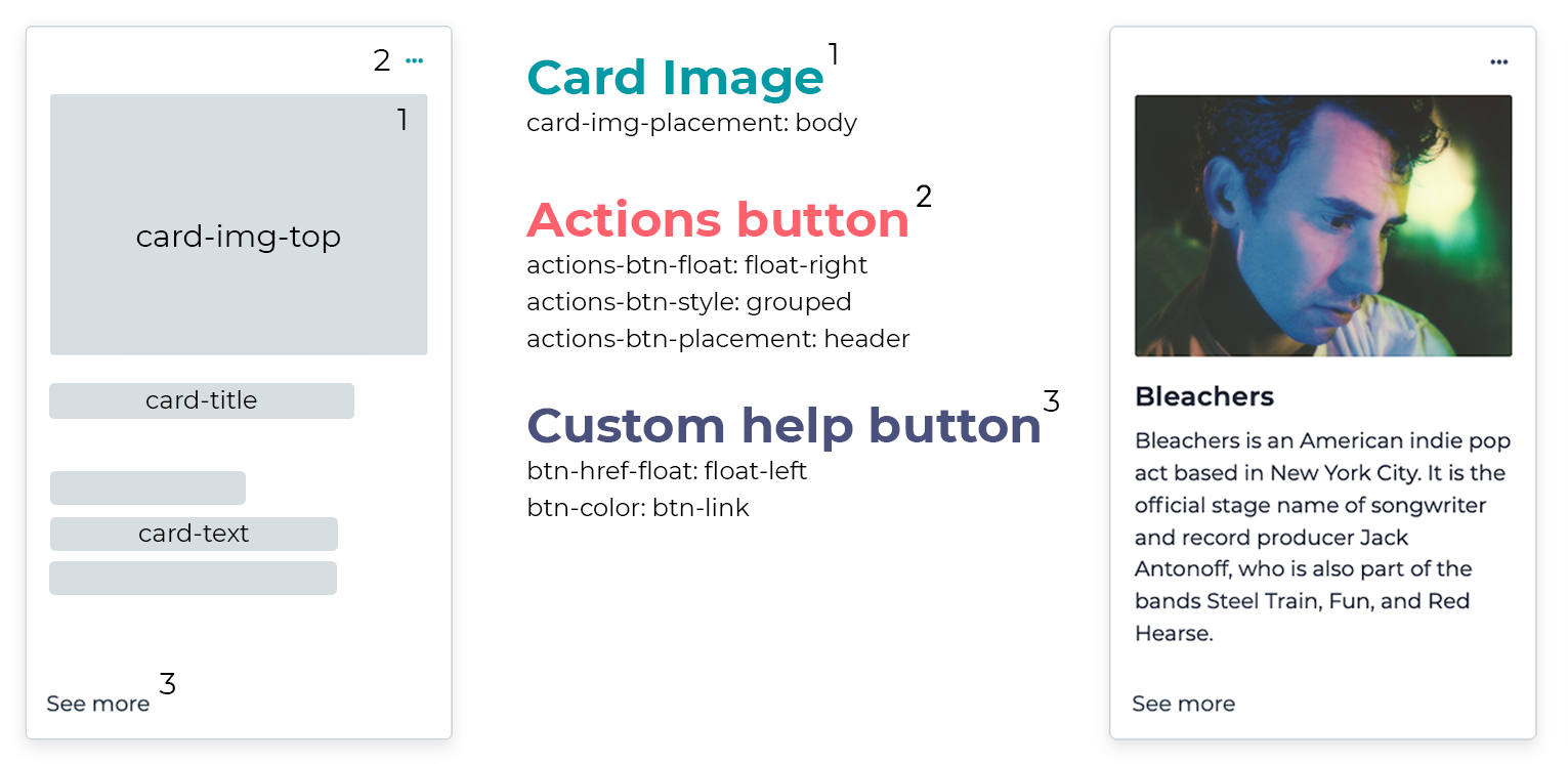
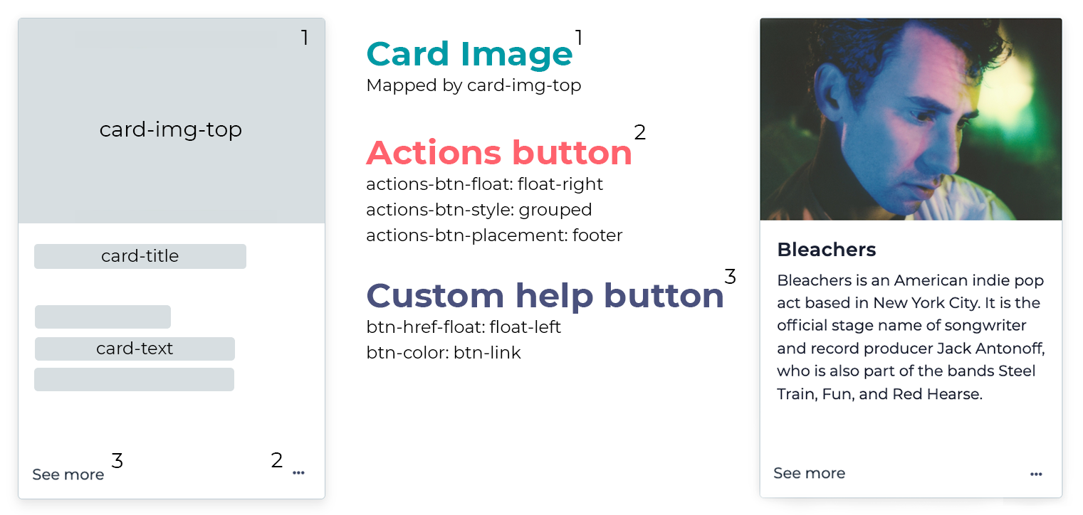
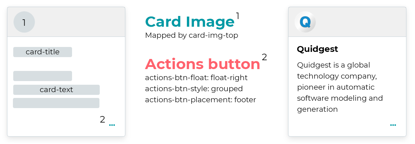
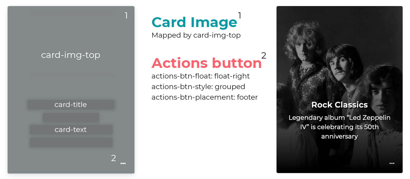
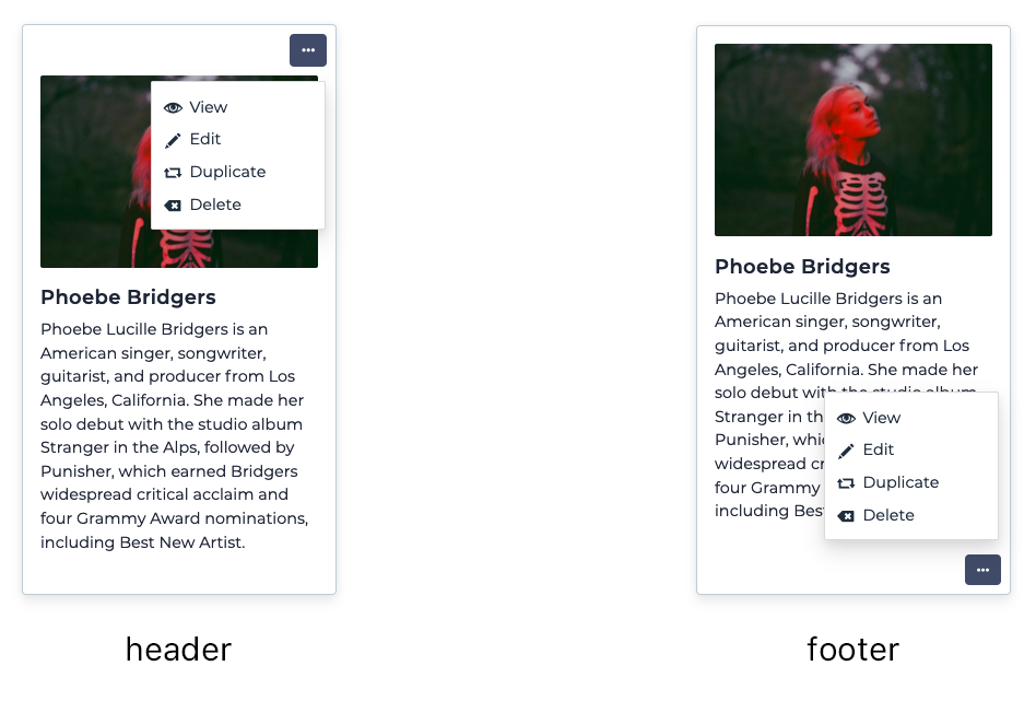
actions-btn-placement
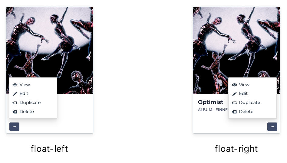
actions-btn-float
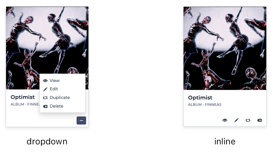
actions-btn-style
align-center
card-img-top-shape
show-column-titles
Summary
| Name | Type | Description | Mandatory | Allows Multiple Mappings | Admitted Values | Default | Platforms |
|---|---|---|---|---|---|---|---|
| title | Mapping | The title of the card. Best when mapped to a short text field | Yes | No | Table column | - | MVC, VUE |
| subtitle | Mapping | The subtitle of the card. Best when mapped to a short text field | No | No | Table column | - | MVC, VUE |
| text | Mapping | The main text of the card. Best when mapped to a text field | No | Yes | Table column | - | MVC, VUE |
| image | Mapping | An image at the top of the card. Must be mapped to an image field | No | No | Table column | - | MVC, VUE |
| btn-href | Mapping | Defines the target of the card button. Currently works best when mapped to a hyperlink text field | No | No | Table column | - | MVC |
| custom-followup | Mapping | Overrides the followup obtained from the menu structure. Must be mapped to a text field that contains the URL of the target page | No | No | Table column | - | MVC |
| actions-alignment | Style | Sets the alignment of the action buttons | No | - | left, right |
left |
MVC, VUE |
| actions-placement | Style | Specifies if the action buttons are placed on the header or on the footer of the card | No | - | header, footer |
header |
MVC, VUE |
| actions-style | Style | Defines if the action buttons are displayed as a single button (dropdown) or as individual buttons (inline) | No | - | dropdown, inline |
dropdown |
VUE |
| background-color | Style | The background color of the card | No | - | auto, bg-primary, bg-secondary, bg-danger |
auto |
MVC, VUE |
| container-alignment | Style | Defines the alignment of the cards along the container's main axis | No | - | left, center |
left |
MVC, VUE |
| content-alignment | Style | Defines whether the card's contents are center-aligned horizontally | No | - | left, center |
left |
MVC, VUE |
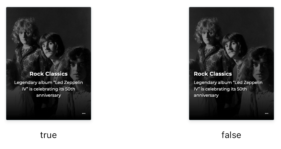
| custom-insert-card | Style | Defines whether or not to display the insert action using a custom card | No | **** | true, false |
true |
MVC, VUE |
| custom-insert-card-style | Style | Defines the display of the insert card to a simple or more complex card | No | **** | image, secondary, primary |
image |
MVC, VUE |
| custom-followup-default-target | Style | Specifies the default name of the browsing context custom card click followups would be loaded into | No | **** | self, blank |
image |
MVC, VUE |
| display-mode | Style | Defines the display mode of the cards | No | - | grid, carousel |
grid |
VUE |
| hover-scale-amount | Style | Configures the amount of scale when hovering the card | No | - | 1.00, 1.01, 1.02, 1.03, 1.04, 1.05 |
1.05 |
MVC, VUE |
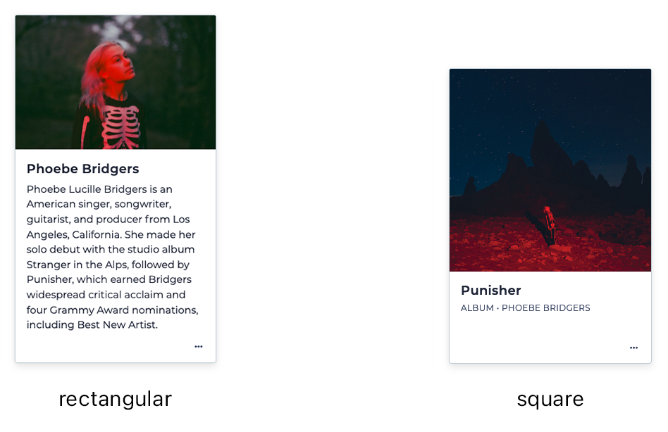
| image-shape | Style | Defines whether the card's top image is a square or a rectangle | No | - | rectangular, square, circular |
rectangular |
MVC, VUE |
| show-column-titles | Style | Defines whether the titles of the columns are displayed next to the contents (only applies to card-text) | No | - | true, false |
true |
MVC, VUE |
| show-empty-column-titles | Style | Defines whether the titles of the columns are displayed next to the empty contents (only applies to card-text) | No | - | true, false |
true |
MVC, VUE |
| size | Style | Defines the size of the card (by category) | No | - | regular, small |
regular |
MVC, VUE |
Changelog
The complete changelog of all notable changes made to visualization modes - Cards. Descriptions are written as New: or Fixed: for changes that are not considered a maintenance release.
Genio 312.08
- (MVC) New: Add
display modestyle variable
Genio 312.07
- (MVC) New: Add
cards-alignmentstyle variable
Genio 310.09
- (MVC) New: Add
card-followupmapping variable
Genio 307.13
- (MVC) Bugfix: Improve the behavior of the "See More" button on cards
Genio 306.99
- (MVC) New: Add new
card-horizontalcard subtype - (MVC) Bugfix: Accessibility fixes and improvements for card pages
Genio 306.80
- (MVC) New: Add
show-empty-column-titlesstyle variable
Genio 306.10
- (MVC) New: Cards: Add
card-sizespecial rendering variable
Genio 305.65
- (MVC) Bugfix: Protect cards rendering from inconsistent LSTCOL state
Genio 305.62
- (MVC) New: Display "No records" figure in cards container when there are no cards to be displayed
Genio 305.11
- (MVC) New: Add
show-column-titlesstyle variable
Genio 305.10
- (MVC) Visual improvements in cards pages
- (MVC) New: Add
card-img-backgroundcard subtype
Genio 304.43
- (MVC) Fixed: Accessibility issues on card pages
Genio 304.38
- (MVC) New: Add OVERRD_CARDFOLLOWUP manwin tag
Genio 302.59
- (MVC) New: Add
hover-scale-amountstyle variable - (MVC) New: Add CARD_FOOTER manwin tag
Genio 302.16
- (MVC) Improve keyboard navigation for card pages
- (MVC) Improve loading method of card images
Genio 301.26
- (MVC) New: Add
card-img-top,card-centeredandcard-img-thumbnailsubtypes - (MVC) Refactor structure of cards to use 'c-card' CSS class family
- (MVC) New: Add
card-subtitle,card-img-placementandalign-centerspecial rendering variables
Genio 301.03
- (MVC) New: Add
btn-href-floatspecial rendering variable
Genio 301.01
- Initial Build