Usability
UX Design goals
Ultimately UX is about users. But users are not just bunch of people. What they need, in what context and under what mindset defines their unique position in the UX universe. Whether consumer, enterprise or platform, the same users can display different mindsets while using them. Hence approach can’t be uniform.
- Consumer UX The whole interaction between a user and an offering that enables personal, emotional, social and economical gratification.
- Enterprise UX The targeted interaction between a user and business processes that enables increased productivity through workflow and process driven collaboration.
- Platform UX The interaction between a user and a set of contents, applications, processes, services or people that enables creation of discrete solutions to match unique contexts.
As an Enterprise solution all three of these user stereotypes must be accounted for in designing an application and our design process ensures they are taken into account.
UX Design components
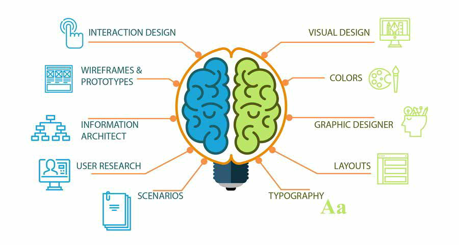
The design process involves the study and creation of multiple design artifacts. These are the results of an UX and UI tandem approach
UX - Human-first approach to Product design
- Focus: The full experience from a user’s first contact to the last
- Creates: Structural design solutions for pain points that users encounter anywhere along their journey with the product
- Results in: Products that delight users with their effectiveness
UI - Human-first approach to designing the aesthetic experience of a Product
- Focus: Visual touchpoints that allow users to interact with a product
- Creates: Combinations of typography, animations, color palettes, buttons and imagery
- Results in: Products that delight users aesthetically
The resulting artifacts can then be categorized in the following way:

Web application checklist
The interface design follows a strict set of guidelines that push the interface towards a user centric experience.
Strive for consistency
Consistent sequences of actions should be required in similar situations; identical terminology should be used in prompts, menus, and help screens; and consistent color, layout, capitalization, fonts, and so on, should be employed throughout. Exceptions, such as required confirmation of the delete command or no echoing of passwords, should be comprehensible and limited in number
Seek universal usability
Recognize the needs of diverse users and design for plasticity, facilitating transformation of content. Novice to expert differences, age ranges, disabilities, international variations, and technological diversity. Adding features for novices, such as explanations, and features for experts, such as shortcuts and faster pacing, enriches the interface design and improves perceived quality.
Offer informative feedback
For every user action, there should be an interface feedback. For frequent and minor actions, the response can be modest, whereas for infrequent and major actions, the response should be more substantial. Visual presentation of the objects of interest provides a convenient environment for showing changes explicitly.
Design dialogs to yield closure
Sequences of actions should be organized into groups with a beginning, middle, and end. Informative feedback at the completion of a group of actions gives users the satisfaction of accomplishment, a sense of relief, a signal to drop contingency plans from their minds, and an indicator to prepare for the next group of actions.
Prevent errors
As much as possible, design the interface so that users cannot make serious errors. If users make an error, the interface should offer simple, constructive, and specific instructions for recovery. Erroneous actions should leave the interface state unchanged, or the interface should give instructions about restoring the state.
Permit easy reversal of actions
As much as possible, actions should be reversible. This feature relieves anxiety, since users know that errors can be undone, and encourages exploration of unfamiliar options. The units of reversibility may be a single action, a data-entry task, or a complete group of actions, such as entry of a name-address block.
Keep users in control
Experienced users strongly desire the sense that they are in charge of the interface and that the interface responds to their actions. They don’t want surprises or changes in familiar behavior, and they are annoyed by tedious data-entry sequences, difficulty in obtaining necessary information, and inability to produce their desired result.
Reduce short-term memory load
Humans’ limited capacity for information processing in short-term memory requires to avoid interfaces in which users must remember information from one display to another display. It means that cellphones should not require reentry of phone numbers, website locations should remain visible, and lengthy forms should be compacted to fit a single display.
Role of Genio automation
Many of the findings of this process are ultimately highly reusable. We, in fact, have interface consistency as a necessary metric for user experience. The Genio modeling process guarantees that once put into patterns these artifacts are broacasted to all web application generated by it and the options of those patters are clearly identified.
This creates a large pool of reusability and normalization that is realized in:
- Semantic styling variables
- Multiple layout definitions
- Component behaviour options
- Alternative components for data display