Help items
Rules
User helps are user-triggered messages that provide additional information about an element or feature.
These are the ways to activate these messages according to each component:
- Inputs and Input Group: Popover, Tooltip and Subtext.
- Buttons: Popover and Tooltip.
- Zones:
- Groups: Popover, Tooltip and Subtitle.
- Collapsibles: Popover and Tooltip.
- Tabs and Wizard phases: Subtitle.
- Tables: Popover, Tooltip, Subtitle and Info-banner.
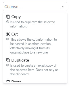
- Dropdowns: Subtext.
If a help type has been defined for the detail help and it does not exist, that help type will not be displayed.
It’s not possible to set the same type of help for short and detail for the same component.
| Settings | Tooltip | Popover | Subtext | Subtitle | Info-banner |
|---|---|---|---|---|---|
| Initiated By | Hover (mouse) | Click | - | - | - |
| Terminated When | User leaver predefined interaction area | User taps to close or click another area of screen | - | - | - |
| Paired Element | Page element label | “i” icon | Text on page | Text on page | Text on page |
| Content Type | Short help | Short or Detailed help | Short help | Short or Detailed help | Short or Detailed help |
Define types of helps
There are two ways to define types of helps:
-
Through Layout Editor (default value for all components of the selected type of the application):
Variables for helps:
- InputShortHelpControl: short help in inputs and buttons.
- InputDetailHelpControl: detailed help in inputs and buttons.
- GroupShortHelpControl: short help in zones.
- GroupDetailHelpControl: detailed help in zones.
- ListShortHelpControl: short help in tables.
- ListDetailHelpControl: detailed help in tables.
Go to Resources > Layout Editor > Selected Application for edit > Layout Options > Select variables options
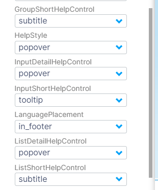
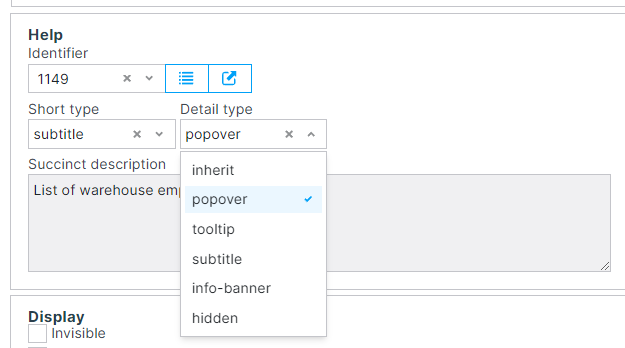
- Through Form Component (component-specific help):
By default the form components have the value "inherit", this value takes the value of the help type from the layout editor.
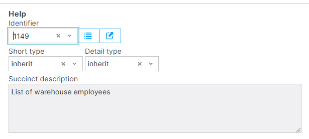
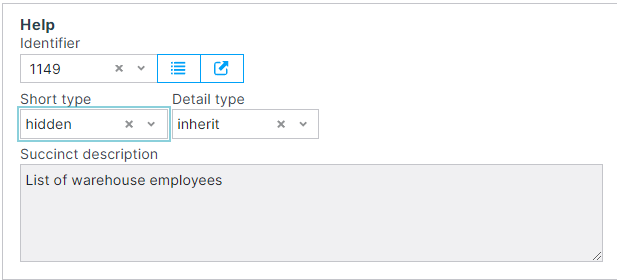
The value "hidden " hides the help when you do not want it to be displayed in the app.
Go to Forms > Forms > Select form to edit > Edit the form component > Help > Select help > Select help type for short and detailed help.
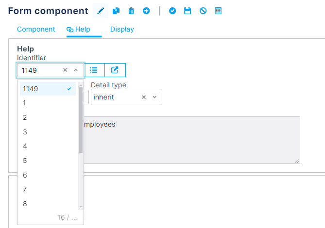
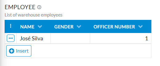
The result look like this:
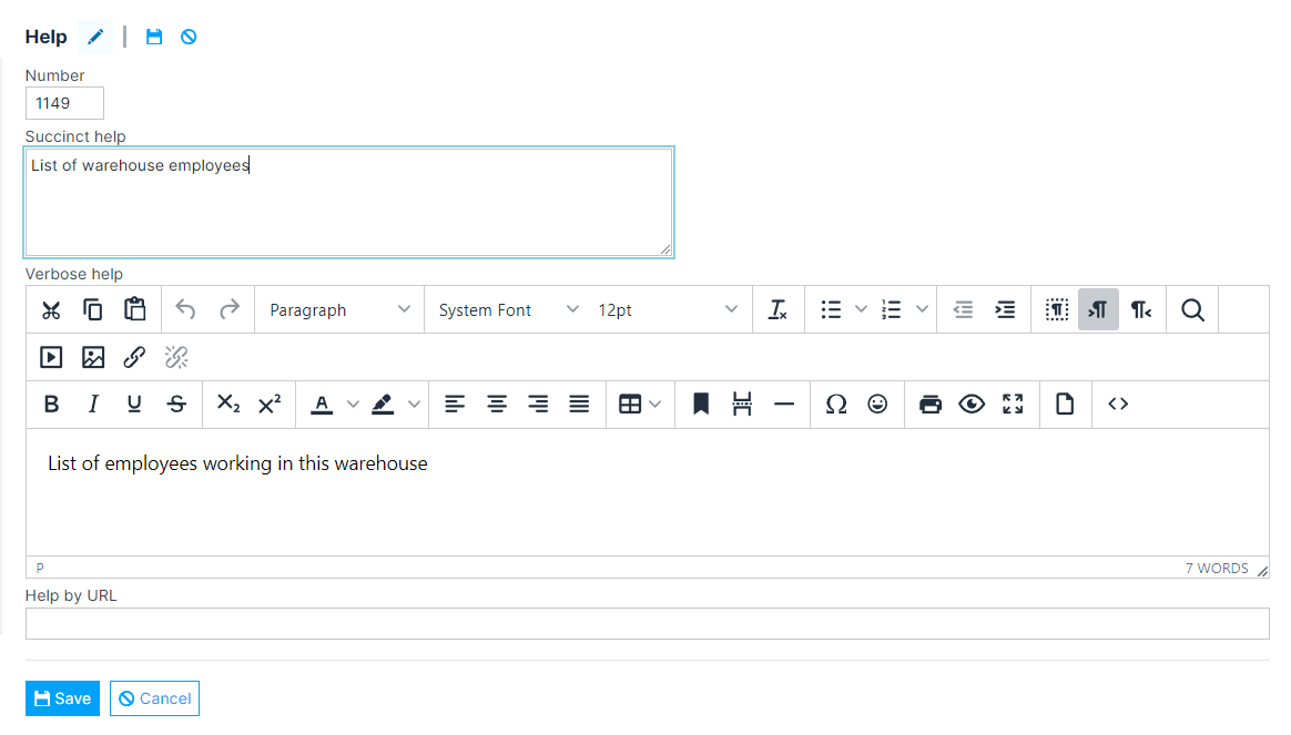
Create Helps
Resources > Help items > Insert help > Define a succinct message - mandatary > Define a verbose message - optional
Helps Definition
Tooltip
The tooltip is usually used to provide the user with a succinct help to the element on the page.

When the developer chooses the Help type as Tooltip:
-
It will appear help succinct in a tooltip
-
If there is a verbose message defined, it will also appear in the type of help that has been defined.
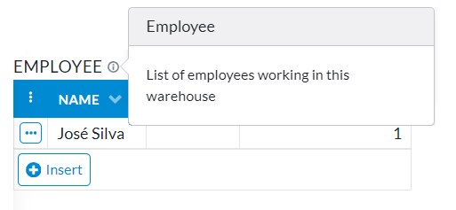
Popover
The popover is generally used to describe in more detail the help of the page element.

Subtext
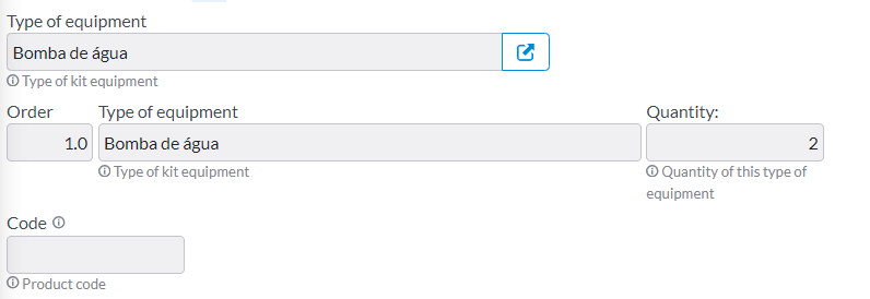
The subtext is usually used to provide the user with a short help of the page element. Only for inputs and inputs groups.
Subtitle
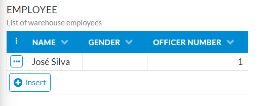
The subtitle is usually used to provide the user with a short or detailed help on zones and tables.
Info-banner
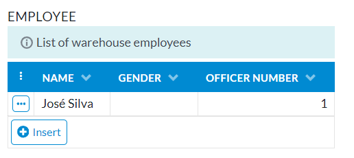
The info-banner is usually used to provide the user with a short or detailed help on tables.
If you want to see help documentation for Backoffice, please go to Help items in Backoffice