Dashboard
Genio has built-in support for specifying dashboard pages. The dashboard pattern is currently offered as a menu followup, with the possibility of being defined as a homepage.
Topics
See also
Overview
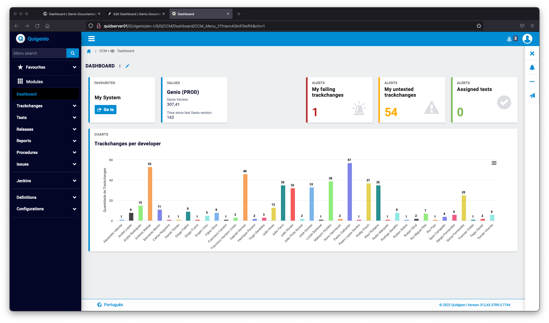
The dashboard pattern provides quick access to important components of the system, such as alerts, bookmarks, or relevant business information.
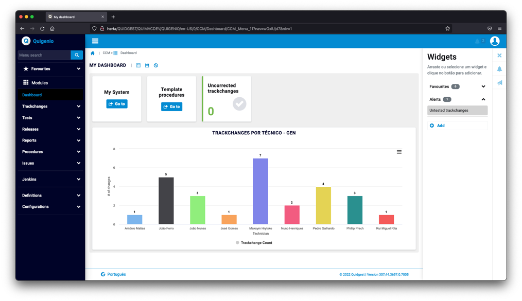
A key feature of the dashboard is its ability to let the users create their own dashboard configurations, based on the available widgets: the users can add or remove widgets from the dashboard, as well as change their position within the dashboard.

Widgets
The dashboard pattern is accompanied by a set of pre-prepared widgets, such as alert or bookmark widgets.
To meet more complex needs, such as chart widgets, a custom widget type is offered, which allows forms to be rendered within the dashboard as widgets. The dashboard pattern currently support the following pre-prepared widgets:
- Alert widgets
- Bookmark widgets
- Menu widgets
- Custom widgets
Alert widgets
Alert widgets are based on the existing Genio alerts. The color and icon follows the alert definition.

Existing alerts can easily be added to the dashboard configuration. However, an alert can only be added to the dashboard configuration if its "Does not generate if" option is disabled. This prevents widgets with no data to be displayed from being added to the dashboard.
Bookmark widgets
Bookmark widgets allow the users to use their bookmaks as widgets of the dashboard. Removing the bookmark will also remove the widget from the list of available widget, as the bookmark ceases to exist.

Custom widgets
As previously described, custom widgets allow the rendering of forms in the dashboard, providing the flexibility required to build the most complex widgets.
Here is an example of a widget that contains a chart, which was built by composing different Genio patterns.

We break down the different patterns involved:
- The dashboard configuration contains a custom widget that points to a form of type "Widget"
- The "Widget" form contains only a table list
- The table list is configured to use the "Graph" special rendering
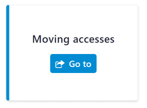
The following image illustrates the process of creating a bookmark widget. Begin by creating a group for your widget in "Widgets Groups", as shown on the left image. Subsequently, insert a new widget in the "Widgets of Dashboard", select the "Menu" option under type and choose the corresponding menu to which the user will be directed.
Base area
As you might have noticed, the break down of the previous example mentions the use of a table list, which implies that the form is positioned on a given record.
This is possible because forms of the "Widget" type allow the base area of the form to be either empty or filled:
- If the base area is empty, the behavior is similar to an "empty form"
- If the base area is filled, the dashboard will provide one widget for each record of the form's base area. Appliable EPHs will filter the list of available widgets.
Title
It might be useful to use dynamic form titles when dealing with custom widgets. For example, if the base area is defined, the use of dynamic titles allows the user to differentiate the provided widgets.
Additional remarks
- When using forms that contain empty table lists (no records to display), the dashboard will automatically resize the widget to fit the table.
Properties
| Property | Description | Availability |
|---|---|---|
| Order | The default order of the widget | All widgets |
| Group | Defines the group of the widget in the widget panel | All widgets |
| Required | Defines whether the user may or may not remove the widget from the dashboard. Required widgets must be visible by default | All widgets |
| Visible (by default) | Defines whether the default is visible by default | All widgets |
| Width | The width (in units) of the widget | All widgets |
| Height | The height (in units) of the widget | All widgets |
| Side border | Defines whether the widget should display a side border | All widgets |
| Identifier | The unique identifier of the widget | All widgets |
| Title | The title of the widget | Alert widgets |
| Type of widget | The type of the widget | - |
| Alert | Speficies an alert to be source of data for alert widgets | Alert widgets |
| Custom widgets | Specifies the form to be rendered as the widget content | Custom widgets |
| Data refresh | The mechanism used to refresh the widget data | Alert and custom widgets |
| Refresh rate | The refresh rate of the widget. Appliable only if the data refresh is set to "Automatic (Periodic)" | Alert and custom widgets |
| Cache | Defines whether the widget data should be cached or not | Alert and custom widgets |
| Cache TTL | Specifies how long (in seconds) the cached data should be valid for | Alert and custom widgets |
Widget panel
The widget panel is where the user can find the available widgets that have not been placed in the dashboard.

Widget groups
To improve the usability of the widget panel, widget groups can be defined. Their purpose is to bring collapsible sections to the widget panel, keeping it organized when many widgets are available.
Additional remarks
- All bookmark widgets are automatically grouped in the widget panel. Creating a group for them will have no effect.
Configuring a dashboard
We break down the steps to configure a dashboard and its widgets, from start to finish.
Creating the dashboard
The dashboard pattern is currently available as a menu followup. To add a dashboard to your application, start by inserting it in the menu tree.
The dashboard entry will show up in the menu tree as a menu of type "DS".
To start configuring the dashboard, open the newly created entry.
The title of the dashboard will generate a text resource, so it is translatable across the different languages of your application.
Adding the widgets
In the dashboard configuration, right-click the list of widgets and select "Insert" to add a new widget to the configuration.
Configure the widget and click "Save".
To create a graphic widget, you must first create a form for this graphic. Proceed by inserting an unfiltered table list into it, as shown below:
Select the appropriate table and form needed to assemble this list. Ensure to add all the necessary columns to it, since you will need that in the next step. Additionally, select the 'Special Rendering' feature.
Within the 'Special Rendering' section of the form, insert a 'Chart' and choose a suitable subtype. In this example, a 'GenericGraph' has been implemented. (If the 'Chart' option does not appear initially, insert a map, save both the change and the form, and then reopen it.)
Access the 'Chart' you've created and populate the 'Variables' field with your chart's configurations. Depending on the chosen chart, these configurations might include details such as axis, axis name, graph title, and chart type, as shown below:
Once you've saved your form, navigate back to the menu tree where you initially inserted your 'DS' dashboard. Make sure that you create the group for your chart widget as described above, then proceed to insert a 'Custom' widget for your chart, selecting the form you just created, as demonstrated below:
At last, ensure that your chart's length property is set to 'Dynamic'. Failing to do so may result in visualization issues within your application. Open your form editor and change the property, as follows:
Setting as home page
After the dashboard is configured, you might want to set it as the home page of its module. Start by inserting a new home page.
Add the dashboard by selecting its module and menu entry.
The dashboard will now automatically open as soon as the user opens its module.