Data Grid
A Data Grid presents data from a database table in a structured format of rows and columns. It is dependent on the relationship established between tables and automatically filters data from a related table based on the current record in the form. For instance, when displaying a customer form, the corresponding data grid lists only the orders associated with that customer.
Data grids can be used as standalone lists or embedded within forms to display related records. They support configuration options such as search, sorting, export, conditional visibility, and totalizers.
The same data can also be represented through Visualization Modes allowing alternative views such as cards, charts, or maps to enhance the user experience.
Once a data grid or table list is defined, its behavior can be customized through several configuration options that control how users view, search, and interact with the displayed data.
Data grids can also be configured as unfiltered, displaying all records from a table without applying relationship-based filters. This variation is described in detail later in this section.
Search
Prior to version 302.01 the quick search behavior was to search all columns in the list. The option is still there, but it's no longer the default behavior.
When you use the top level bar to search for a text, a list of searchable columns will appear:
 Figure 1. Quick search.
By selecting one of the items, the advanced search row will appear in the list with the query value in the selected column:

Figure 2. Advanced search.
Default columns
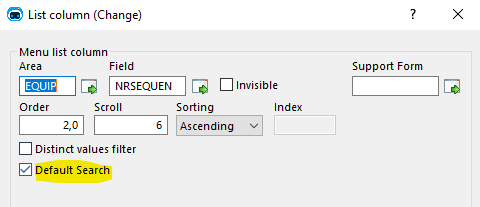
If you search for something in the quick search without specifying a column, the system will search the column marked as default.
 Figure 3. Column default search option.
- If no column is defined, it will search in the first searchable column.
- If there is more than one column, there will be a generation error.
- Genio will suggest the first human key of each column as default columns
Advanced column options
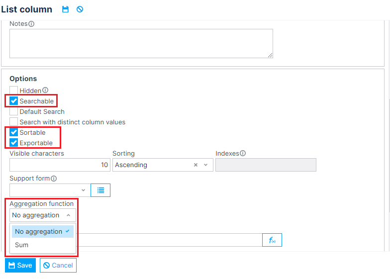
From version 352.00 onwards, Genio supports further customization options for data grid columns.
 Figure 4. Advanced column options. Highlighted, in a top-to-bottom order: Searchable, Sortable, Exportable and Column totalizers.
Searchable columns
Setting a column's Searchable field to false excludes it from list's search options, preventing users from filtering the data grid by that column.
The following column types are not searchable:
- Images
- XML
- Geographical Coordinates
This feature is available from version 352.00 onwards.
Sortable columns
Setting a column's Sortable field to false prevents users from sorting the data grid by that column.
The following column types are not sortable:
- Images
- Documents
- XML
- Geographical Coordinates
This feature is available from version 352.00 onwards.
Exportable columns
Setting a column's Exportable field to false excludes it from the columns included in document exports.
This feature is available from version 352.00 onwards.
Hidden columns vs. Show-when conditions
List columns can be set to appear hidden by default in the final application by checking the Hidden checkbox shown in Figure 4. This ensures that the column is not shown in the data grid itself, but can be made visible by accessing the list's column configuration form (when enabled).
Show-when conditions, when not verified, fully hide the column, making sure that it doesn't appear on neither the list or the column configuration. Nevertheless, the code for the column is still generated, so that it can be used in, for instance, formulas that use row information.
This feature is an adaptation of the previous implementation of column show-when conditions, and is available from version 352.23 onwards.
Column totalizers
When aggregation functions are applied to table columns, they display the sum of each column's record values directly in the data grid. When enabled on at least one visible column, a highlighted row appears above the table footer to display these totals.
 Figure 5. Regular data grid with totalizers enabled in the "Days for return" and "Total value" columns.
As shown above, totalizers are configurable on a per-column basis, allowing users to select which columns should display totals. Additionally, the displayed values account for all records in the database, not just those currently visible on the screen.
 Figure 6. Multiple selection data grid with totalizers enabled.
When used in multiple selection data grids, totalizers display both the sum for all records and a separate total for the selected records.
Performance considerations
It is important to note that the calculations of these values are done server-side. With that in mind, enabling this feature on tables with massive amounts of records could result in increased loading times and server load. Nevertheless, thorough testing was performed in tables with up to 10000 records with no noticeable performance impact. Moreover, various performance-enhancing mechanisms were implemented:
- Query optimization: The totalizer calculations are performed together with the record counting query, to avoid unnecessary database accesses.
- Multiple selection totalizers: In multiple selection lists, selecting records doesn't require database accesses to update the total value. Instead, it relies on a client-side offset mechanism, that adds or subtracts to the server-retrieved value based on row selections.
- Optional queries: To avoid unnecessary server load, totalizer calculation is only performed if the table has visible or hidden columns with totalizers enabled.
- Editable data grid totalizers: In editable data grids (see Editable data grid), since there is no pagination, all calculations are performed client-side, both after the component renders and according to user changes. This avoids excessive or unneeded server access.
This feature is available from Genio 352.15 onwards.
Visualization modes
Data grids allow users to organize and manage multiple records or datasets within a single view. The information defined in a data grid can later be presented in richer, more dynamic ways — for example, through Visualization Modes such as graphs, charts, maps, or cards. This means the same underlying data structure can serve both as an input form (for editing and managing data) and as a visual representation (for analysis or presentation).
 Figure 7. Visualization mode in Data Grids
Unfiltered Data Grid
An Unfiltered Data Grid (also known as an Unfiltered Table List) is a variant of the data grid that displays all records from a table, without applying any relationship-based filters. Unlike standard data grids, which automatically restrict the displayed data to records related to the current form’s context, unfiltered data grids operate independently of table relationships and therefore access the full contents of the selected table.
This type of grid is typically used in dashboards, administrative views, or when displaying data that is not directly dependent on a parent record. However, because it provides unrestricted access to all records in a table, it should be used carefully to avoid data privacy or performance issues.
Note: Unfiltered data grids support the same configuration options as regular data grids (such as search, sorting, and totalizers), but these actions are applied to the entire dataset, not to filtered subsets.