Forms-editor
title: 'Forms Editor' date: '15:55 03-11-2025' taxonomy: category:
The Forms Editor provides a drag-and-drop interface where users can design and configure form layouts in a Genio application. It allows adding and organizing components visually, adjusting layout options, and customizing how data is displayed and interacted with. To successfully save a form, the user must first enter the Forms Editor.
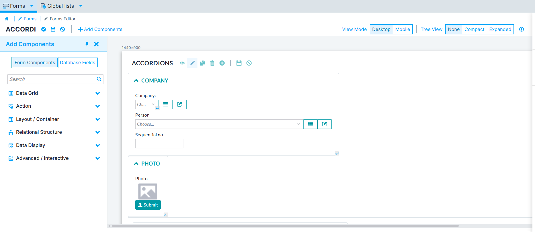 Figure 1. Forms Editor
Form Components
The form components are divided into six sections.
- Data Grid - Contains components that display and manage tabular or structured data, such as lists and grids. These components allow users to view, filter, sort, and interact with data records.
- Action- Includes components that perform operations or trigger events, such as running routines, opening forms, generating reports, or executing automated processes.
- Containers-Defines how form elements are organized and displayed. These settings control structure, positioning, and grouping of components within the form layout.
- Relational Structure- Provides components that represent relationships between entities, enabling users to manage multiple or related values within a form.
- Data Display- Groups components used to show read-only information, such as text, images, or pre-filled data, helping users view content without editing it.
- Interactive- Includes specialized components that add interactivity or external integrations, such as charts or embedded applications, to extend form functionality.
Containers
The Form display can be altered through multiple options. When adding components, it is given the Layout/Container option, where the user can choose between several container options.
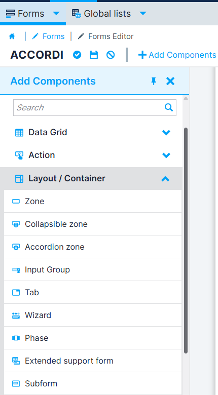 Figure 2. Form Containers
- Zone: It is simply a zone that allows the structure of the form layout.
- Collapsible zone: The collapsible zone is a user interface pattern enabling users to reveal or conceal related page content sections manually
- Accordion zone: The accordion is a user interface pattern enabling users to reveal or conceal related page content sections, but differently from collapsible zones, each time you can have one of the zones open
- Input group: Zone grouping inputs with inputs, buttons, or span tags and placing the borders correctly.
- Wizard: The Wizard component allows you to group components into a series of steps that follow a linear path or branch into multiple ones.
- Phase : Each step you need to implement individually as a Phase; all of the Phases should belong to the same area and the wizard.
- Tab: A zone that uses tabs for navigating between various forms, each with the tab form type.
- Extend support form: Reserve space in the form to open another form showing the information relative to the selected row of a table list or unfiltered list.
- Subform: It is common to encounter situations where we need to collect similar information across different forms.
Layout
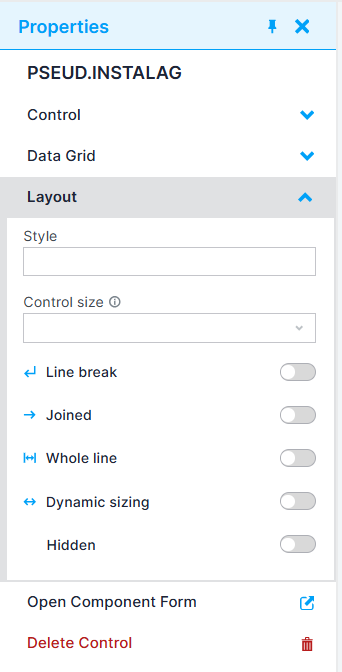 Figure 3. Properties menu
When selecting a component, a Properties menu should appear, allowing the user to perform multiple actions, such as altering its controls or field and the layout. The Layout section defines how each component is displayed and positioned within the form.
| Option | Description |
|---|---|
| Style | Defines a custom CSS class to apply to the component for styling purposes. |
| Control size | Adjusts the size of the control (Mini, Small, Medium, Large, XLarge, XXLarge). |
| Line break | Starts the next component on a new line. Useful for organizing elements horizontally or vertically. |
| Joined | Combines adjacent controls visually in a single line. |
| Whole line | Expands the component to occupy the full width of the form row. |
| Dynamic sizing | Adjusts the component’s width to fit available layout space for a more flexible form layout. |
| Hidden | Hides the component from view while keeping it available in the form logic. |
💡 Tip: In the Control size use Small fields for short inputs (5–10 characters, e.g., codes); Use Medium fields for standard inputs (20–50 characters, e.g., names); Use Large fields for long inputs (100–200+ characters, e.g., comments).
Note: Input groups with icons or buttons reduce the available text space — choose field sizes accordingly.